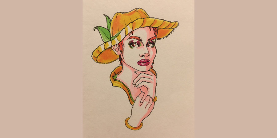
Hey, everyone! This week we’re going to be exploring closeups, with drawings dated from March 5th to March 9th. I hope everyone is having a great week so far. I’m feeling pretty good because I finally finished my deck of cards and a lot of people are interested in them! I’ve ordered them from my supplier and now it’s just a matter of time before I send them out. If you’re interested in seeing them, visit my instagram.
Now let’s start exploring these closeups!
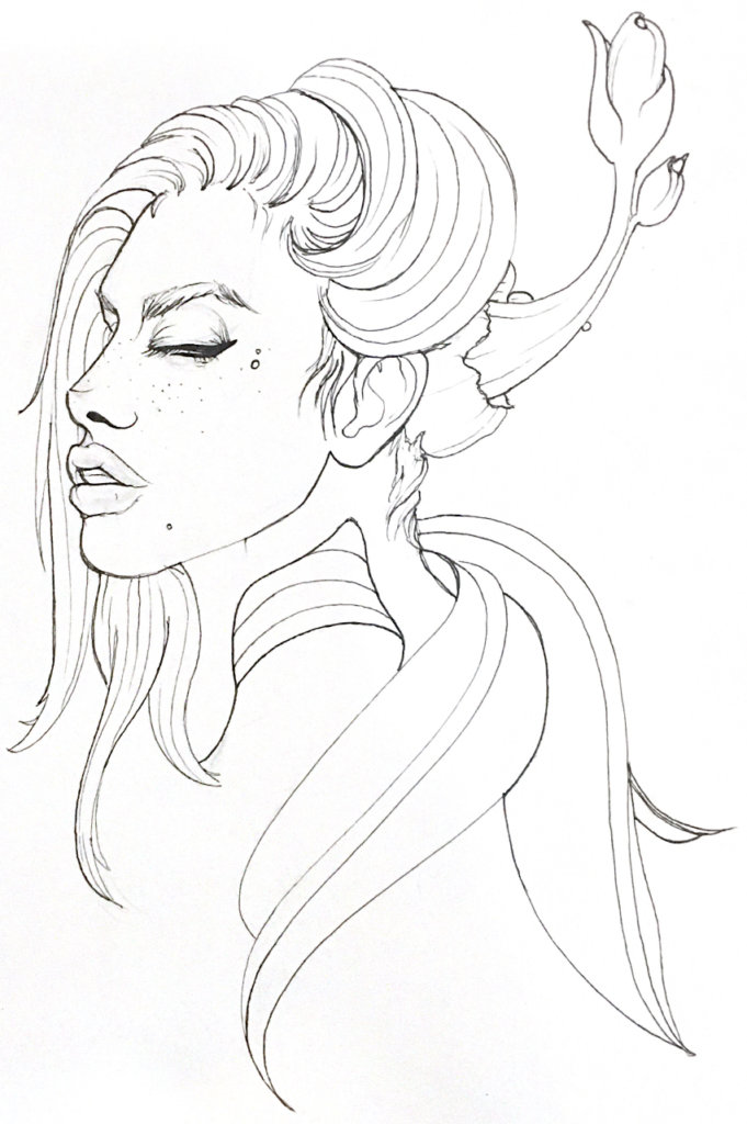
This may be one of my favorite close-ups I’ve done. I love her freckles, her face, her hair. I think there’s a lot of movement in this drawing, between the leaves, the sprouting flower, and her hair. Perhaps her eyes are a little wide and her mouth juts out too far, but let’s ignore those flaws.
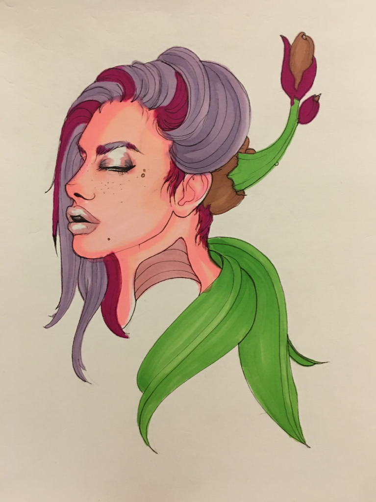
Yep – color is way better. Most of the time, I prefer drawing bald women (why, I don’t know. A love of androgyny, maybe?), but back in March I was loving drawing hair. I think the color and the movement works so well in this piece!
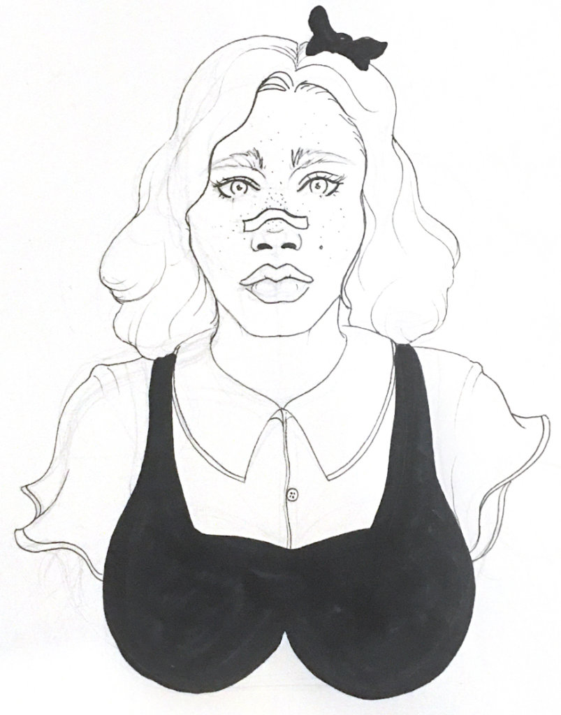
The most massive breasts ever haha. I wish this one had worked out a little better. I liked the concept so much, but the construction didn’t work that well. The proportions of her face don’t match. For instance, look at her eyes. They should probably be much wider, to match her nose and her lips, because both of those features are quite large. Let’s take a look at the color version.
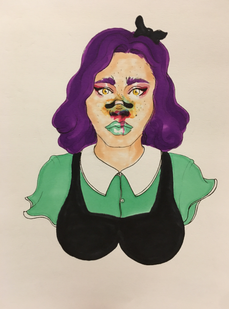
Sometimes I can cheat things when adding color. Adding some “makeup” seems to enlarge the eyes a little bit. With shadows comes dimension, and a slight narrowing of features.
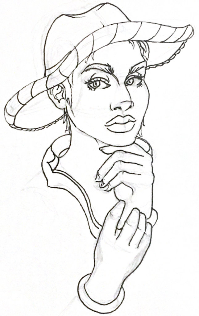
I love this country girl, for some reason. Her features are so exaggerated (cheekbones, lips, nose, etc.), but I totally love it. I’m also quite proud of her hands – I spent time really observing the fingers and making them look somewhat believable! Hands and fingers are tough to draw… for me.
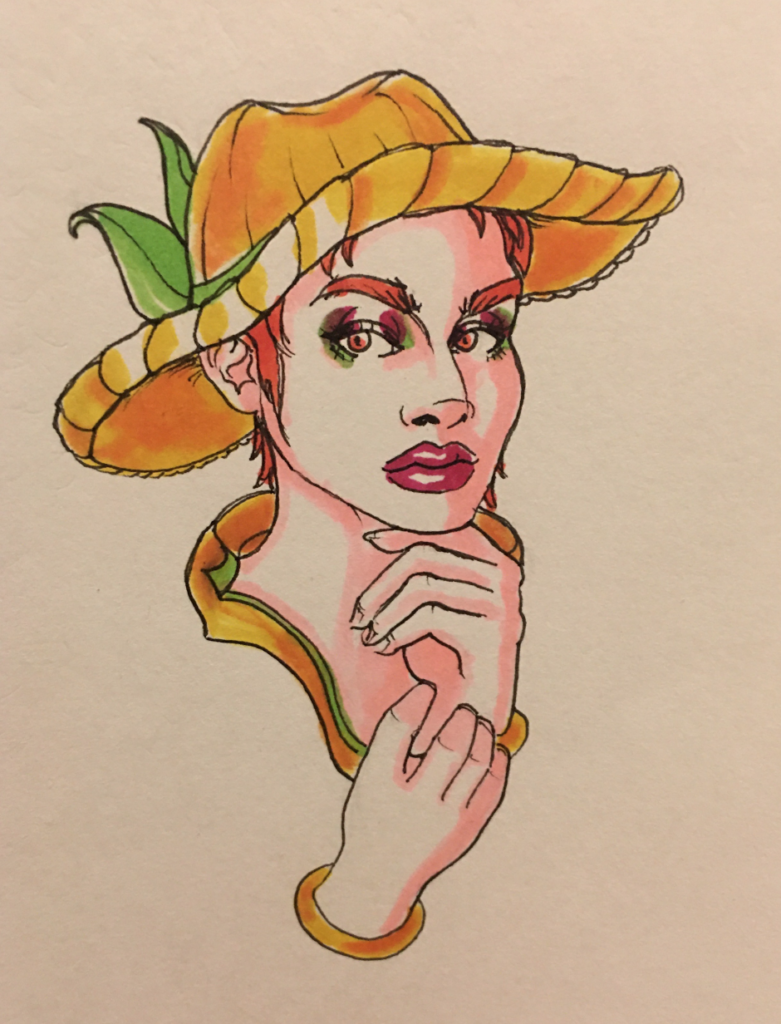
And yay! The color version worked out, too. I think the colors really bring this drawing to life. I’m a big fan of monochrome and colors that work well together on the color wheel. So like, red, orange, yellow are all next to each other, etc.
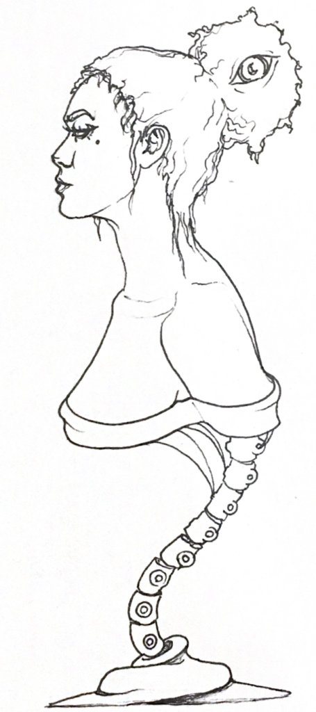
The mounting, again! I love this person. She looks so aloof and over it. Goals, right? And what’s the deal with the eye in her bun?!

I’m happy with the color here, too. Blue and shades of pink were such common skin/shadow colors for me for so long. I don’t use them the same way in my current drawings much, but posting this makes me think maybe I should explore it some more.
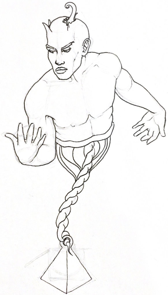
This guy! Do you all hate that you can see the underlining pencil marks? I kind of like it, because it gives you an idea of how I lay things in. So many art tutorials and classes will tell you to draw with confident lines that aren’t “hairy” or “scratchy,” but you know what…? I’m going to draw how I’m going to draw, and when I’m sketching out the base for my piece, I’m probably not as confident as I should be.
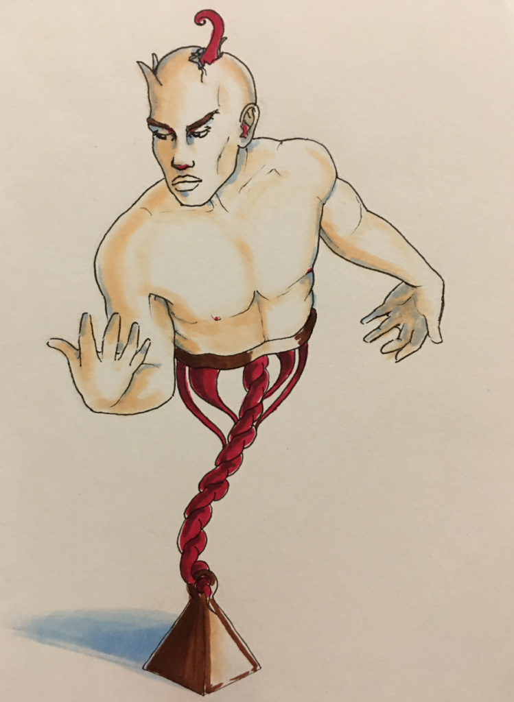
And color! I like this guy a lot, too, but I wish I had drawn his face better. I am still struggling with faces. I think I need to spend an entire eight hour day just drawing face after face after face. In theory, I know what I’m supposed to do to draw the average face, but sometimes it’s easier said than done. I know I need to spend more time observing, too. As always… I’m a work in progress.
I hope you’ve enjoyed exploring closeups with me. In the near future, probably 99% of my postings will be of full-body poses. Enjoy the closeups while you can!
If you’re interested in any pieces or have questions about anything, feel free to write me on here, or DM me on instagram. Have a great week!
